

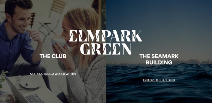
I worked with Red Dog on a re-invention of Elm Park Green, an important commercial and residential campus along Dublin city’s sweeping south bay
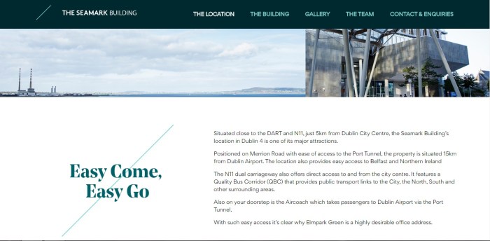
The location is second-to-none: right by the coast, within easy access of Dublin’s bustling city centre yet within sight of the Wicklow Mountains. The campus, meanwhile, is a vibrant self-contained space for living and working. This contrast gave birth to the new endline ‘A city outside, a world within.’
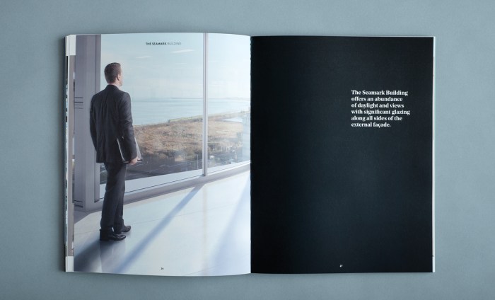
The campus features a powerful, imposing eight story building which faces the sea. Originally built as a hospital or hotel, since being bought by Starwood Capital Group, it has been repurposed as a state-of-the-art office building, so it needed a new name; a name that captured something of its timeless solidity, its sense of safe haven. We explored many options but one name kept recurring:
seamark
[see-mahrk]
noun
1.
a conspicuous object on land, visible from the sea, serving to guide or warn mariners, as a beacon.
It just felt right.
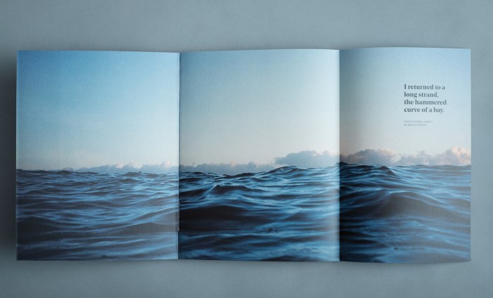
Red Dog based the visual identity around a Gary Coyle image. They created a beautiful brochure and won Design for Print at the IDI Awards 2017, .


Agency: Red Dog
